
One Hundred Dollars by The Ministry of Type for Wired
/
The full illustration.When creating, or even looking at, a banknote design, one of the first things you realise is their inherent and very deliberate imperfections. There’ll be an apparent mis-registration of colour, a strangely ragged line, a discontinuity in a pattern or an odd serif or ligature on a piece of lettering, but it’s exactly how it was designed. Without it, it wouldn’t be right. The design of banknotes represent something I find gloriously poetic — imperfect perfection — if it was perfect by our usual standards, it would be imperfect. Wonderful. So tried to capture some of that in my design, overlaying colours with an offset, adjusting the lettering a little bit to reflect the kind of oddities on real dollar notes and creating the odd layer of extra guilloche-work barely fine enough to see. I’m glad Wired is well printed and that it all came through.

The design of currency is fascinating in its intricacies.
Carol Dweck's Attitude About Intelligence
/Most famously, Dweck and her collaborators have demonstrated that praising children for their intelligence can backfire. When young people’s sense of self-worth is bound up in the idea that they are smart—a quality they come to understand as a genetic blessing from the sky—at least three bad things can happen. Some students become lazy, figuring that their smarts will bail them out in a pinch. Others conclude that the people who praise their intelligence are simply wrong, and decide that it isn’t worth investing effort in homework. Still others might care intensely about school but withdraw from difficult tasks or tie themselves in knots of perfectionism. (To understand this third group, think of the Puritans: They did not believe they had any control over whether they were among God’s elect, but they nonetheless searched endlessly for ways to display that they had been chosen, and they were terrified of any evidence that they were not.)
via chronicle.com
Penguin Classics team up with (RED) for typographic covers
/
Penguin has collaborated with AIDS awareness fund (RED) and a team of designers to produce new covers for eight Penguin Classics. Each cover replaces the usual black band with red, employing a quote from the text of the book as the visual hit (covers by Coralie Bickford-Smith shown left and Non-Format, right)…
While a repackaging isn’t something the Classics series is necessarily crying out for, we particularly like the way that this small run of eight titles has been handled – with the typographic designs occasionally encroaching over the (RED)-inspired band and the link with the organisation brought out in the bracketing of the Penguin Classics identity. Jim Stoddart, art director of Penguin Press plans to use a different typographer for each cover commission and more are planned in the near future.
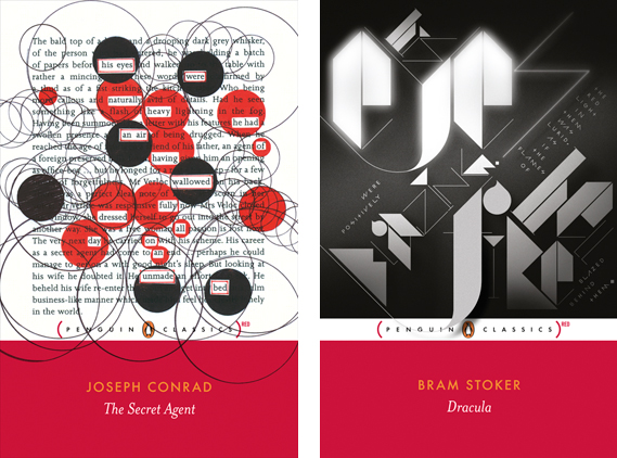
Click on the link above to see the whole series. Fantastic.