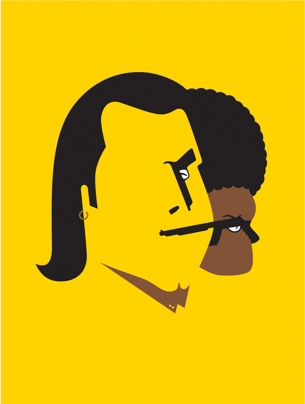
The Powerfully Simple Work of Noma Bar

noma bar

Noma Bar is a man of few strokes. But don’t let the simplicity fool you. His talent lies in his efficiency in depicting characters and social issues. With bold colors, shapes and one or two icons he captures the spirit of a person. Other times he communicates a message on a social issue with amazing clarity while adding a bit of humor to everything. Whether the message is about violence or equality, his straight-forward visual approach is refreshing.


More examples of his work at the link above.


Antonio Ortiz

Antonio Ortiz has always been an autodidact with an eclectic array of interests. Fascinated with technology, advertising and culture he has forged a career that combines them all. In 1991 Antonio developed one of the very first websites to market the arts. It was text based, only available to computer scientists, and increased attendance to the Rutgers Arts Center where he had truly begun his professional career. Since then Antonio has been an early adopter and innovator merging technology and marketing with his passion for art, culture and entertainment. For a more in-depth look at those passions, visit SmarterCreativity.com.

What Milton Glaser is reading right now


Reality Hunger: A Manifesto by David Shields: http://amzn.to/aZDSYD

Antonio Ortiz

Antonio Ortiz has always been an autodidact with an eclectic array of interests. Fascinated with technology, advertising and culture he has forged a career that combines them all. In 1991 Antonio developed one of the very first websites to market the arts. It was text based, only available to computer scientists, and increased attendance to the Rutgers Arts Center where he had truly begun his professional career. Since then Antonio has been an early adopter and innovator merging technology and marketing with his passion for art, culture and entertainment. For a more in-depth look at those passions, visit SmarterCreativity.com.

One Hundred Dollars by The Ministry of Type for Wired


The full illustration.

When creating, or even looking at, a banknote design, one of the first things you realise is their inherent and very deliberate imperfections. There’ll be an apparent mis-registration of colour, a strangely ragged line, a discontinuity in a pattern or an odd serif or ligature on a piece of lettering, but it’s exactly how it was designed. Without it, it wouldn’t be right. The design of banknotes represent something I find gloriously poetic — imperfect perfection — if it was perfect by our usual standards, it would be imperfect. Wonderful. So tried to capture some of that in my design, overlaying colours with an offset, adjusting the lettering a little bit to reflect the kind of oddities on real dollar notes and creating the odd layer of extra guilloche-work barely fine enough to see. I’m glad Wired is well printed and that it all came through.


The design of currency is fascinating in its intricacies.


Antonio Ortiz

Antonio Ortiz has always been an autodidact with an eclectic array of interests. Fascinated with technology, advertising and culture he has forged a career that combines them all. In 1991 Antonio developed one of the very first websites to market the arts. It was text based, only available to computer scientists, and increased attendance to the Rutgers Arts Center where he had truly begun his professional career. Since then Antonio has been an early adopter and innovator merging technology and marketing with his passion for art, culture and entertainment. For a more in-depth look at those passions, visit SmarterCreativity.com.

Penguin Classics team up with (RED) for typographic covers

Penguin has collaborated with AIDS awareness fund (RED) and a team of designers to produce new covers for eight Penguin Classics. Each cover replaces the usual black band with red, employing a quote from the text of the book as the visual hit (covers by Coralie Bickford-Smith shown left and Non-Format, right)…

While a repackaging isn’t something the Classics series is necessarily crying out for, we particularly like the way that this small run of eight titles has been handled – with the typographic designs occasionally encroaching over the (RED)-inspired band and the link with the organisation brought out in the bracketing of the Penguin Classics identity. Jim Stoddart, art director of Penguin Press plans to use a different typographer for each cover commission and more are planned in the near future.


Click on the link above to see the whole series. Fantastic.


Antonio Ortiz

Antonio Ortiz has always been an autodidact with an eclectic array of interests. Fascinated with technology, advertising and culture he has forged a career that combines them all. In 1991 Antonio developed one of the very first websites to market the arts. It was text based, only available to computer scientists, and increased attendance to the Rutgers Arts Center where he had truly begun his professional career. Since then Antonio has been an early adopter and innovator merging technology and marketing with his passion for art, culture and entertainment. For a more in-depth look at those passions, visit SmarterCreativity.com.

360° Color: A Peek Inside Pantone

It is fascinating to see how the ubiquitous Pantone chips are made.

via vimeo.com

Antonio Ortiz

Antonio Ortiz has always been an autodidact with an eclectic array of interests. Fascinated with technology, advertising and culture he has forged a career that combines them all. In 1991 Antonio developed one of the very first websites to market the arts. It was text based, only available to computer scientists, and increased attendance to the Rutgers Arts Center where he had truly begun his professional career. Since then Antonio has been an early adopter and innovator merging technology and marketing with his passion for art, culture and entertainment. For a more in-depth look at those passions, visit SmarterCreativity.com.